Project type
‍
Client Project
Brand Identity System
Contribution
-
Brand strategy & positioning
- Colour & typography system
- Brand presentation
My role
‍
Brand Designer
Tools
Adobe Illustrator
Adobe Photoshop
Project Details
‍
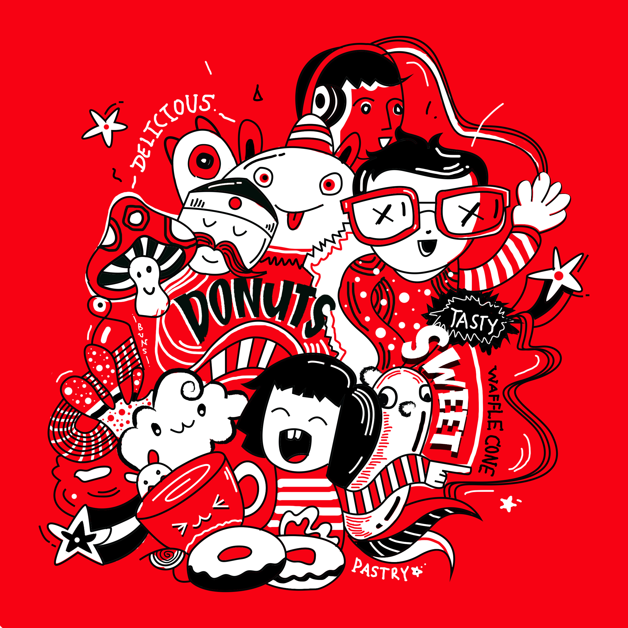
The concept was to create a playful and bold bakery brand identity that feels youthful, memorable, and visually rich. Through hand-drawn illustrations and character-driven storytelling.  By combining expressive characters with bakery-inspired elements, the design builds a fun visual story that strengthens the brand’s personality across multiple touchpoints.
Using only two colors helps create a strong visual recall. Even without reading the name, users can instantly recognize the brand.
Project type
‍
Client Project
Brand Identity System
Contribution
- Brand strategy & positioning
- Colour & typography system
- Brand presentation deck
My role
‍
Illustration and
Typography Designer
Tools
‍
Adobe Illustrator
Project Details
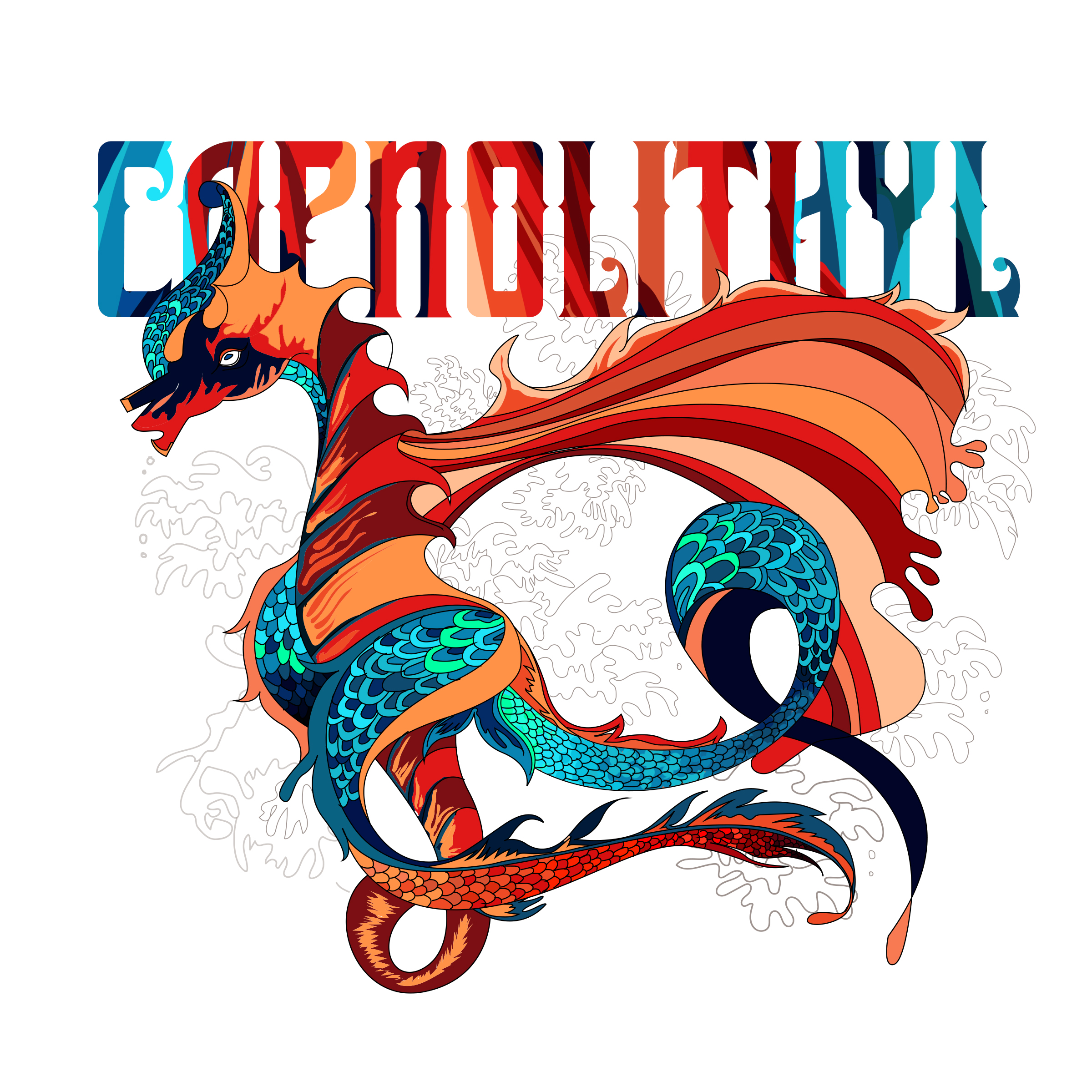
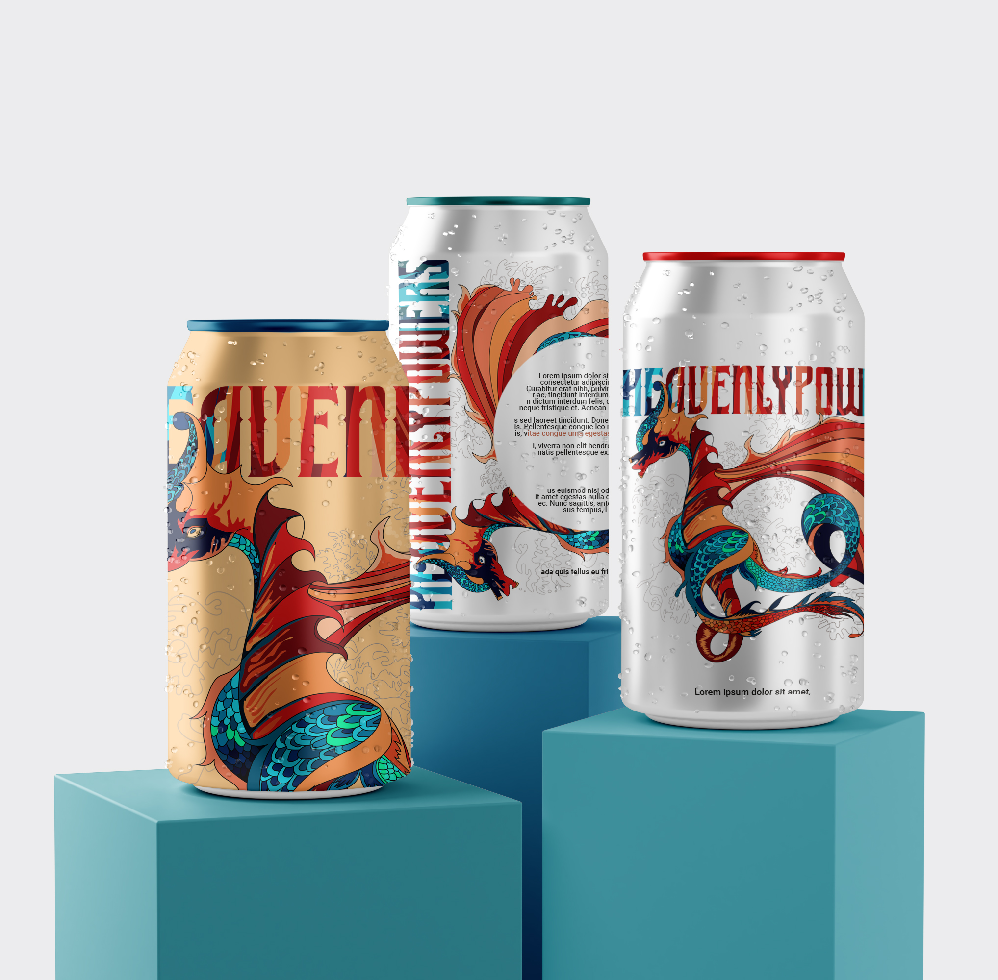
The design approach focused on building a high-impact energy drink identity through bold typography, Japanese-inspired graphic elements, and dynamic illustration. The visual system was created to reflect energy, attitude, and intensity while making the packaging feel distinctive, modern, and attention-grabbing.
Project type
Clothing Brand
‍
Lettermark Identity
Contribution
Logo & Trifold brochure Design
Colour & typography system
My role
‍
Illustration and
Typography Designer
Tools
‍
Adobe Illustrator
Project Details
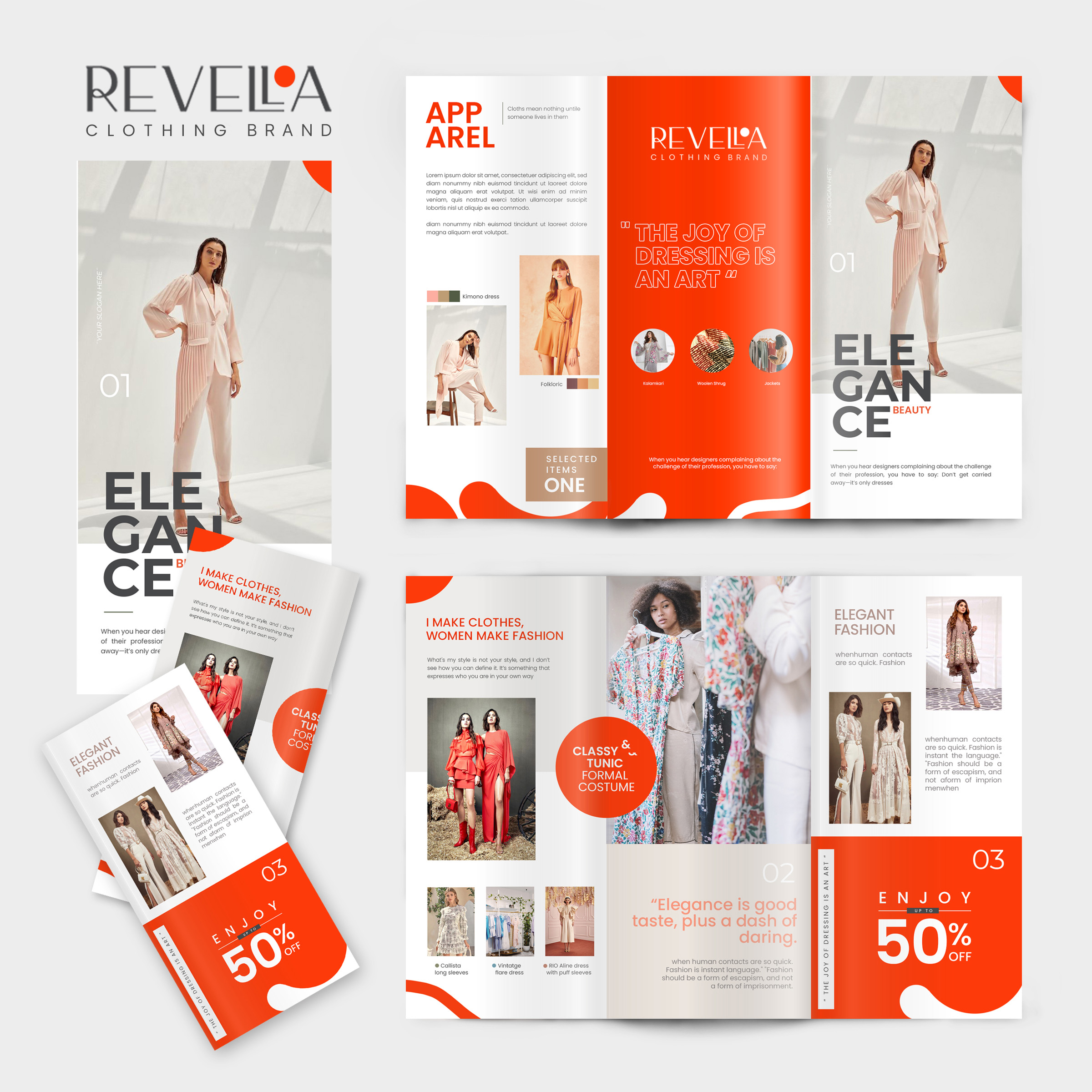
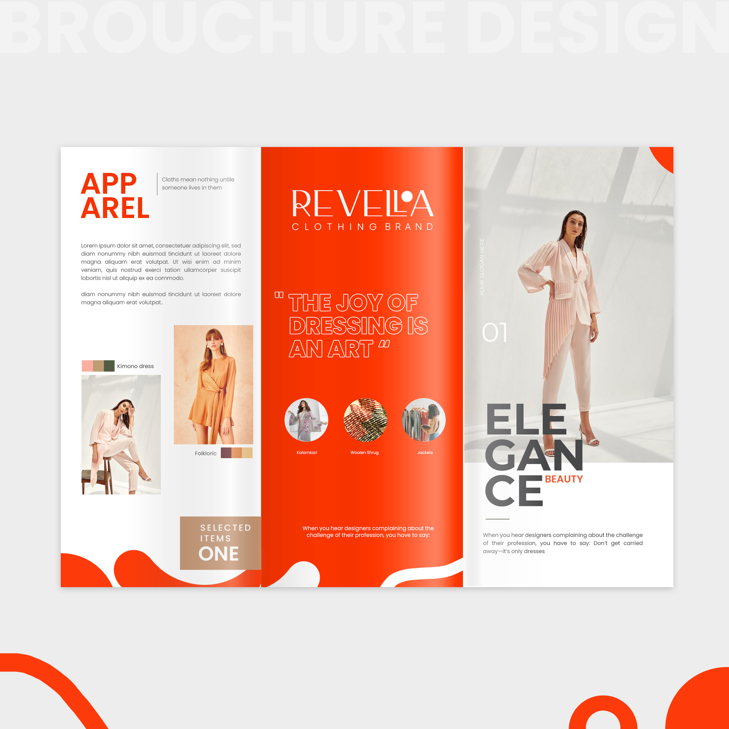
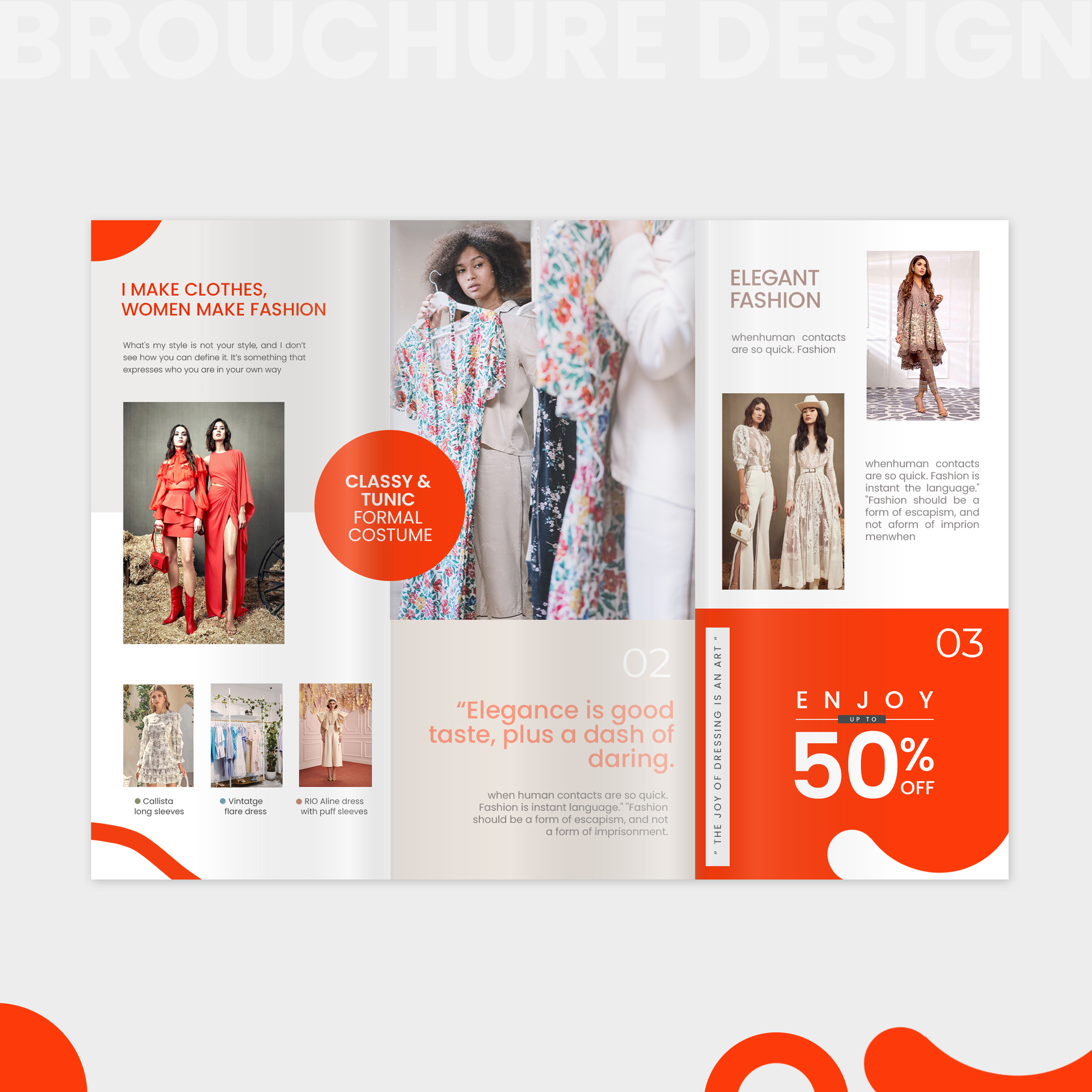
The concept was to create a modern and elegant editorial-style brochure that highlights the fashion brand through clean layouts, bold typography, and a minimal yet visually striking design system. The use of strong orange accents, spacious composition, and structured imagery was intended to reflect confidence, sophistication, and contemporary fashion appeal while creating a polished brand presentation.
The “O” in the Revelloa logo was designed to represent the bindi, symbolizing femininity and cultural identity. This subtle element helps blend Indian tradition with modern western fashion, giving the brand a more meaningful and distinctive visual identity.


Project Overview
‍
This project focuses on developing a modern and cohesive visual identity for a fashion and beauty brand. The objective was to create a strong digital presence that reflects elegance, creativity, and contemporary aesthetics while ensuring consistency across branding and social media platforms.

Research
- Studied current trends in fashion branding and Instagram aesthetics
-
Analyzed luxury and contemporary brands for color, layout, and typography trends
-
Focused on user engagement patterns in social media grids
- Explored minimal vs bold branding balance in beauty and fashion industries

Logo Designs

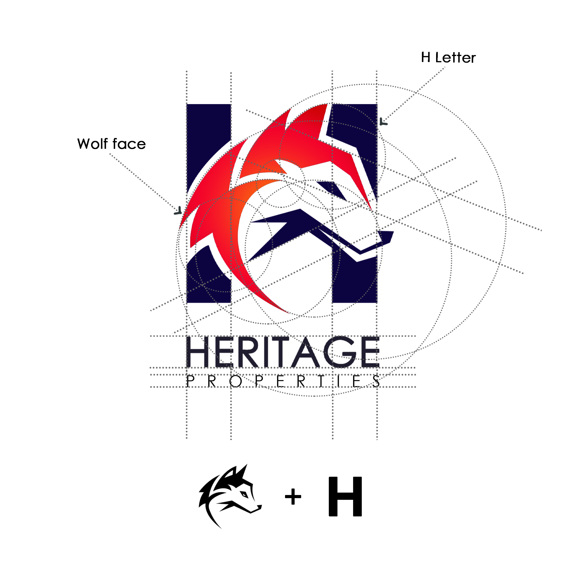
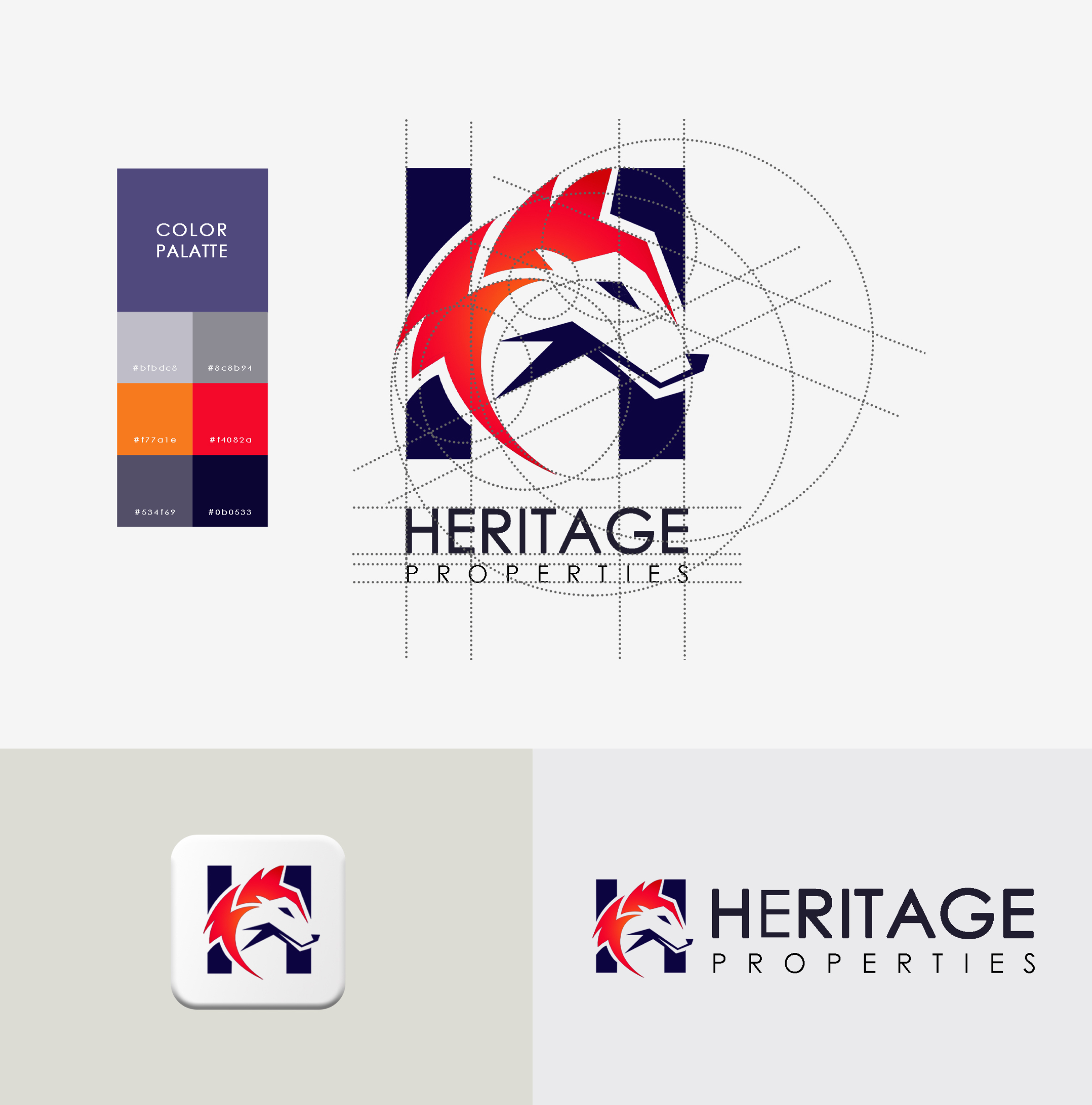
The logo was developed by integrating the letterform “H” with a stylized wolf mark to create a symbol that reflects both architectural stability and brand character. The wolf was chosen for its association with strength, protection, intelligence, and loyalty, making it a strong metaphor for a property brand rooted in trust, legacy, and long-term value. This combination helped shape a visual identity that feels both bold and strategically meaningful.

Lorem ipsum dolor sit amet, consectetur adipiscing elit. Suspendisse varius enim in eros elementum tristique. Duis cursus, mi quis viverra ornare, eros dolor interdum nulla, ut commodo diam libero vitae erat. Aenean faucibus nibh et justo cursus id rutrum lorem imperdiet. Nunc ut sem vitae risus tristique posuere.

Project type
Social Media Design
Campaign Design Post
Ads
‍
Contribution
-Google ads
- Static post design
- Grid aesthetic design
My role
Visualizer
Content Designer
Tools
Figma
Adobe Illustrator
Adobe Photoshop
Adobe after Effects
Amazon Listing Design
Design Slides and Case Study link
‍

Lorem ipsum dolor sit amet, consectetur adipiscing elit. Suspendisse varius enim in eros elementum tristique. Duis cursus, mi quis viverra ornare, eros dolor interdum nulla, ut commodo diam libero vitae erat. Aenean faucibus nibh et justo cursus id rutrum lorem imperdiet. Nunc ut sem vitae risus tristique posuere.

Project type
‍
UI/UX Design
Landing page design
‍
Contribution
-User research & journey mapping
-Information architecture
-Wireframes Design
-Component library & design system
-Interactive prototype
Tools
Figma
Adobe After Effects
Partnership Landing Page – Lead Generation & Conversion Optimization
‍
Project Overview

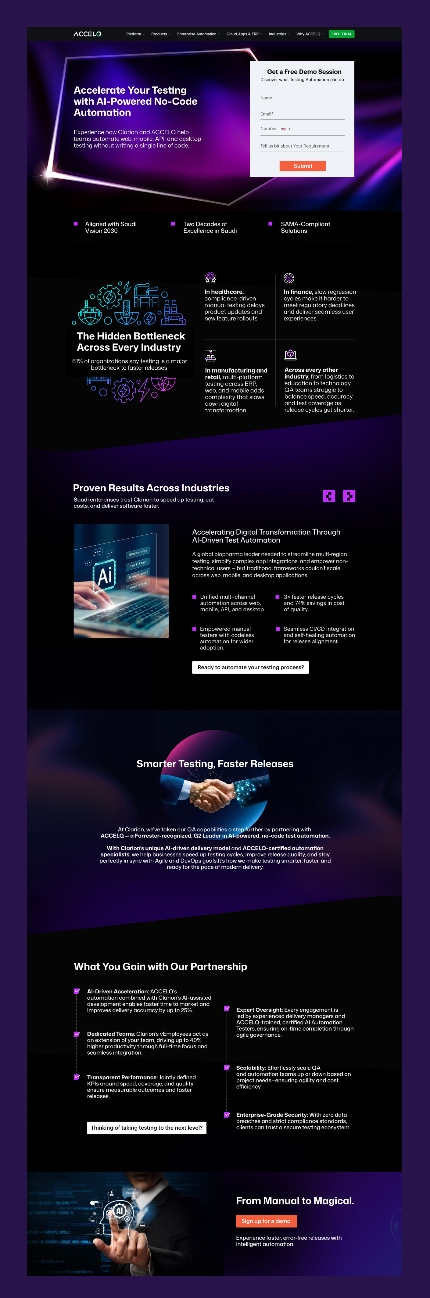
The objective of this landing page was to support a strategic partnership by presenting AI-driven automation services in a clear, engaging, and conversion-focused way. The primary goal was to encourage users to submit a demo request form, positioning the page as a high-intent lead generation channel.
Problem Statement
Businesses exploring automation solutions often struggle with unclear messaging, overwhelming technical content, and complex navigation that distracts from conversion goals. The existing challenge was to:
‍
- Communicate technical value in a simple, understandable way
- Build trust and credibility quickly
- Guide users toward completing a demo request form
- Avoid cognitive overload while explaining complex service offerings
Research & Insights
‍
Research focused on user behavior, decision-making patterns, and enterprise expectations:
‍
‍User Behavior: Users prefer concise messaging with strong proof points rather than long technical explanations.
‍Industry Insights: Enterprise clients value credibility signals such as compliance, partnerships, and measurable outcomes.
‍UX Benchmarking: Successful B2B landing pages prioritize clarity, scannability, and strong CTAs above heavy visual complexity.
‍Conversion Patterns: Form placement, visual hierarchy, and trust indicators significantly influence lead submissions.

Design Approach
1. Clear Value Communication
-
The hero section highlights the core value proposition immediately.
- Supporting text explains benefits in simple language
- Key metrics and trust indicators placed early to build credibility.
2. Conversion-Focused Structure
-
Prominent demo form placed in the hero area for immediate action.
- Strong CTA buttons guide users toward conversion
- Reduced navigation distractions to keep focus on lead generation

Outcome
-Delivered a highly structured, conversion-driven landing page
-
Improved clarity of complex services through visual storytelling
-Increased user engagement with scannable content and strong hierarchy
-Optimized user journey toward demo sign-up (primary goal)
Project type
UI/UX Design
Website Design
Data Platform
Client -
Healthcare Industry
‍
Contribution
-User research & journey mapping
-Wireframes Design
-Component library & design system
-Interactive prototype
Tools
Figma
‍
Full responsive Service page design for an AI-powered healthcare data transformation platform
PROJECT LINK
Project Research
Studied how healthcare enterprise buyers evaluate software through trust, compliance, and cost-saving proof, not aesthetics. Analysed 10+ competitor platforms (Optum, Availity, Change Healthcare). Key finding: buyers need to see credibility in 10 seconds before reading anything. Reviewed real industry stats — provider data errors cost payers $20M+ annually, 81% of denied claims trace back to bad data, 95%+ Medicare Advantage audits fail due to data errors. These numbers shaped every design decision.

To design a user-centered healthcare website that simplifies information, improves engagement, and communicates both medical trust and AI-powered innovation through a clean digital experience.
Cards Designs
The cards in the “Your AI-Powered Partner for Success” section were designed to present AI-powered healthcare benefits in a clear, digestible, and user-friendly format. Instead of overwhelming users with too much information at once, the card layout helps break down each feature into smaller, easy-to-scan content blocks. This improves readability, supports quick understanding, and makes the section feel more structured and approachable.
Icon Story-
Solid fill = authority
— filled icons feel definitive and confident. Outline icons feel exploratory and light weight
‍Single colour = focus — the user's eye goes to the label and the data, not the icon decoration. The icon orients, it doesn't entertain
‍Navy matches the brand — using the same deep navy as the hero and CTA sections keeps the icon system inside the design language, not floating outside it
Outcome
-Page tells a clear 5-step story: Problem → Cost → Solution → How → Proof — readable in 60 seconds without body copy
-Deep navy palette built institutional authority — design reads like it belongs in a compliance boardroom
-Hero GIF and inline data visualisations made the product feel live and real before any demo request
-Three product lines (Roster Automation, Directory Accuracy, Network IQ) are visually distinct
Project Type
Clarion Homepage – Corporate Website Experience Design

Research
- Analyzed B2B tech websites to understand user expectations and browsing patterns
- Identified need for quick trust-building through partnerships, certifications, and client success
- Studied user behavior showing preference for scannable content and clear navigation
- Reviewed competitor sites to benchmark content hierarchy and service presentation
Problem Statement
The challenge was to design a homepage that:
‍
- Clearly communicates Clarion’s services and expertise
- Builds credibility in a short time span
- Avoids overwhelming users with too much technical information
- Encourages user engagement and lead generation
Outcome
- Improved clarity of brand positioning and service offerings
- Enhanced user trust through visible proof points
- Better content flow leading to higher engagement
- Conversion-focused design supporting lead generation goals
Project type
Client project
My role & Contribution
‍
Illustrator
Character concept Design
Variable stroke line art
Tools
Adobe Illustrator
Project- Illustration-Based Monogram Design System
‍
Thought Process

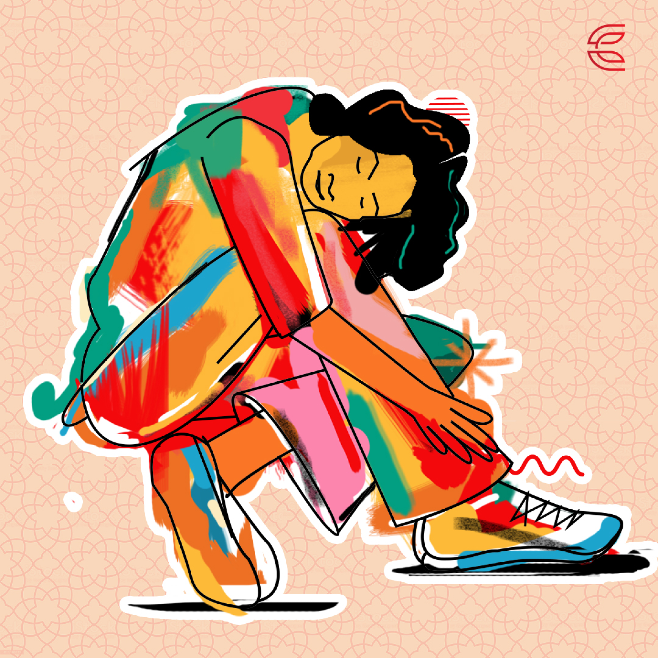
Explored the contrast between complex illustrations and minimal design. Extracted key elements from nature-inspired patterns and translated them into clean, line-based monograms while maintaining clarity and balance.
Design Approach
‍
Used rich, colorful backgrounds with simple geometric monograms. Applied solid color blocks to create separation and ensure visibility. Maintained consistency in style, stroke, and composition.
Outcome
‍
Created a cohesive set of visually striking designs that balance detail and simplicity, resulting in scalable and adaptable branding elements suitable for multiple applications.

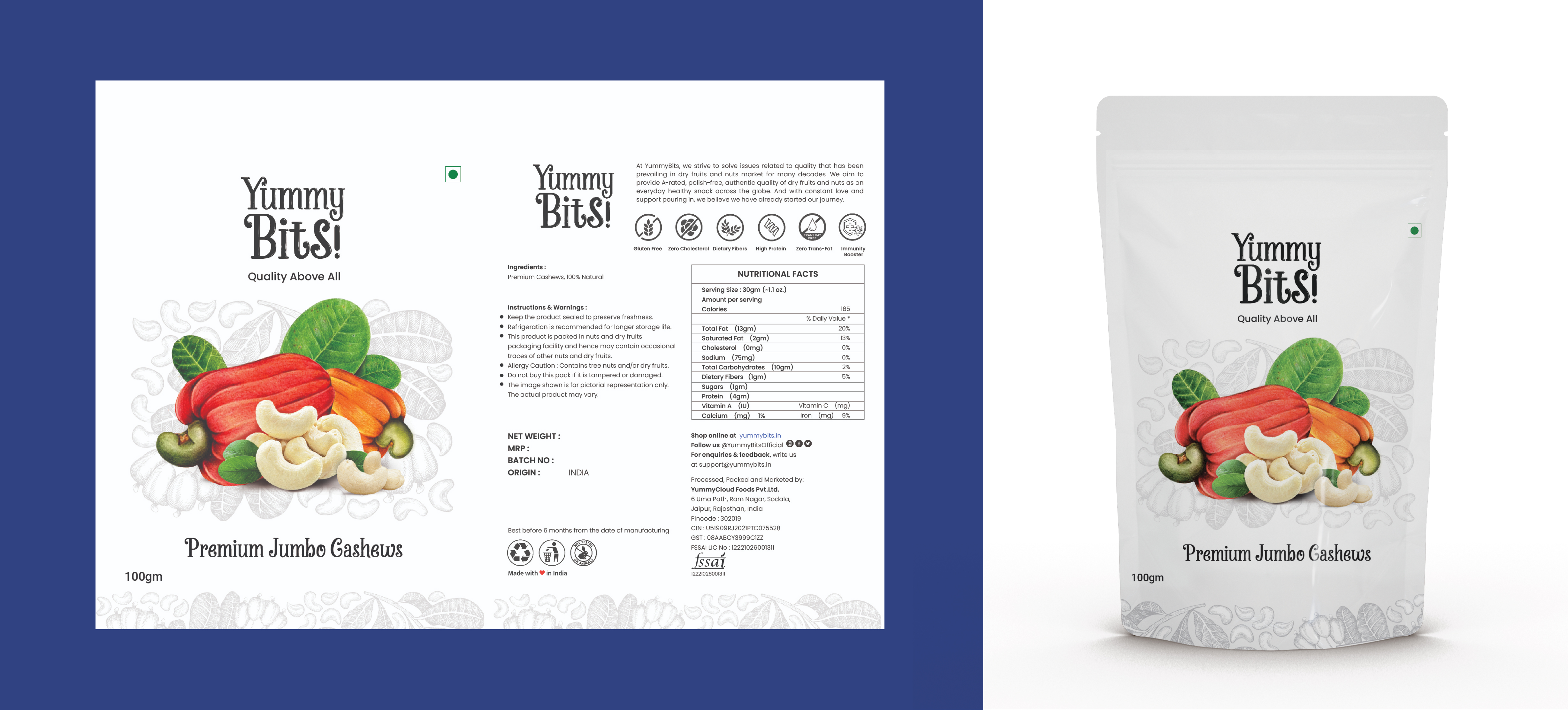
Packaging Design

Project type
‍
Concept Campaign
Illustration + Photography
Contribution
-
Campaign concept development
- Hand-drawn Illustration
- Narrative structure (4-part series)
- Photography compositing & retouching
- Illustration overlay technique
- Colour grading per narrative act
My role
Visual & Campaign Designer
‍
Tools
Adobe Illustrator
Adobe Photoshop
‍
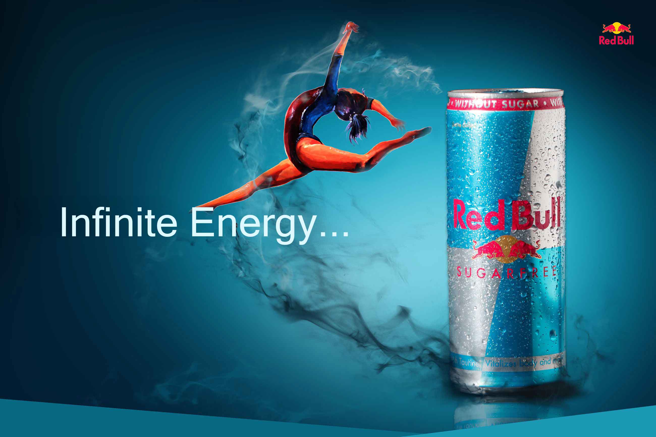
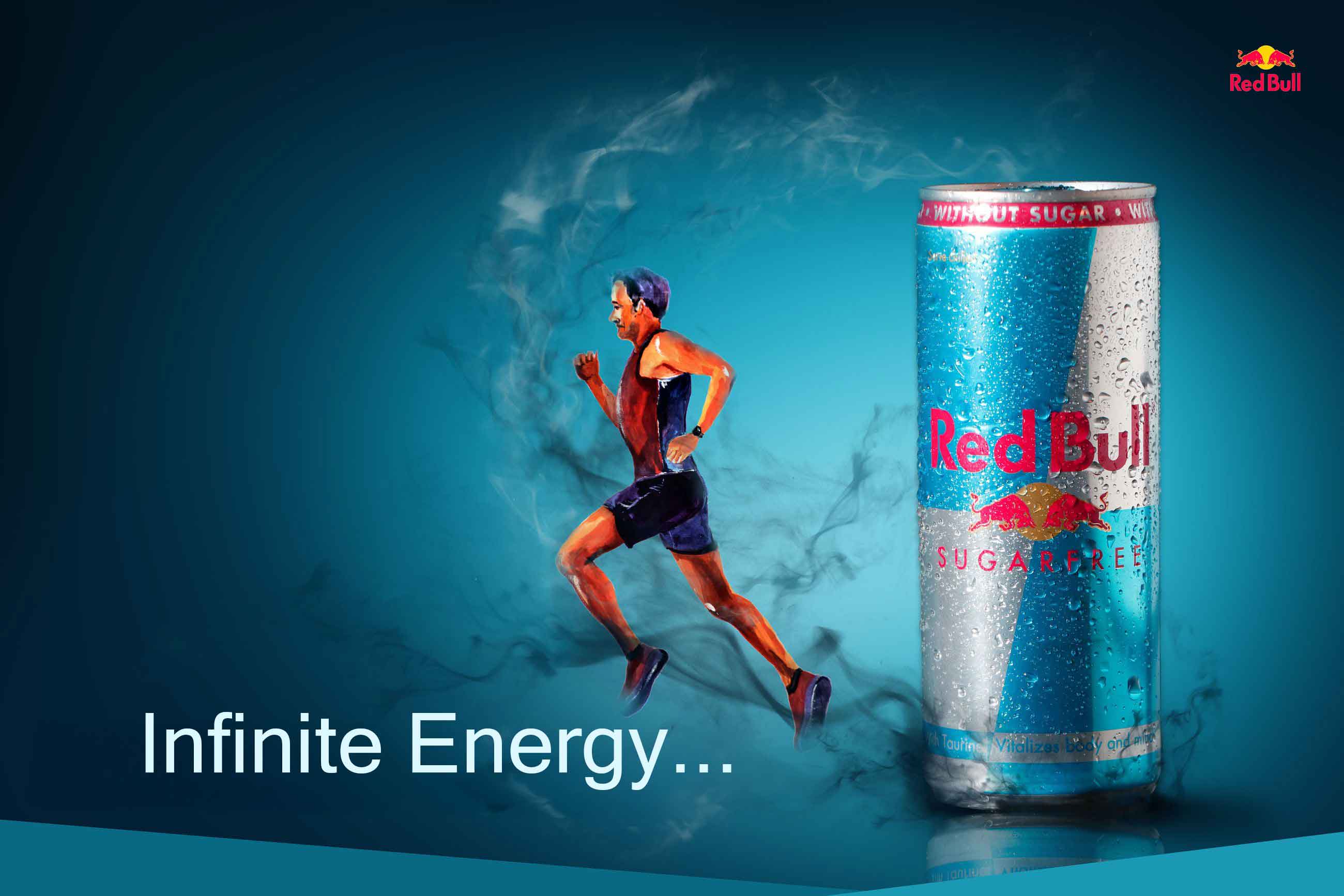
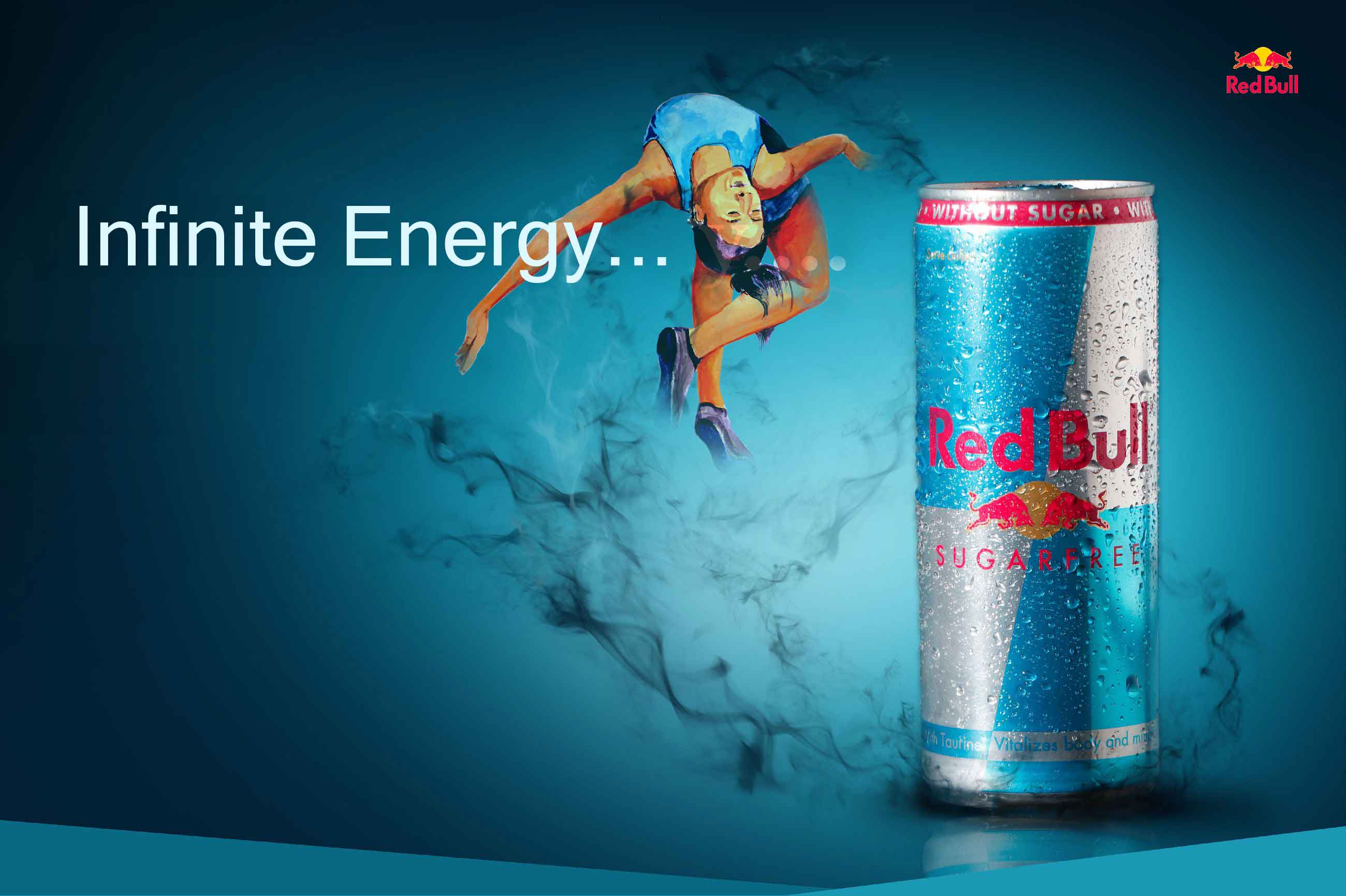
Thought Process
‍
The concept was driven by the idea of “energy in motion.” Explored visual metaphors like wildlife strength and human athletic performance to represent power and intensity. Focused on creating impactful visuals that instantly grab attention and align with the brand’s energetic identity.
Visual Massaging
In the first slide deer and a lion lock eyes, setting the stage for what's to come. The second slide showcases a fierce battle between these two powerful creatures. However, the third and final slide reveals the incredible: the deer emerges victorious. drinking Red Bull makes you powerful, blurring the line between the unbelievable and the believable.
Outcome
Delivered a visually engaging campaign that effectively communicates energy and movement. The designs are bold, memorable, and adaptable across event promotions and digital platforms, strengthening brand recall and audience engagement.
Project Type
Packaging Design
Contribution
- Visual design & composition
- Print-ready artwork
Project Overview
‍
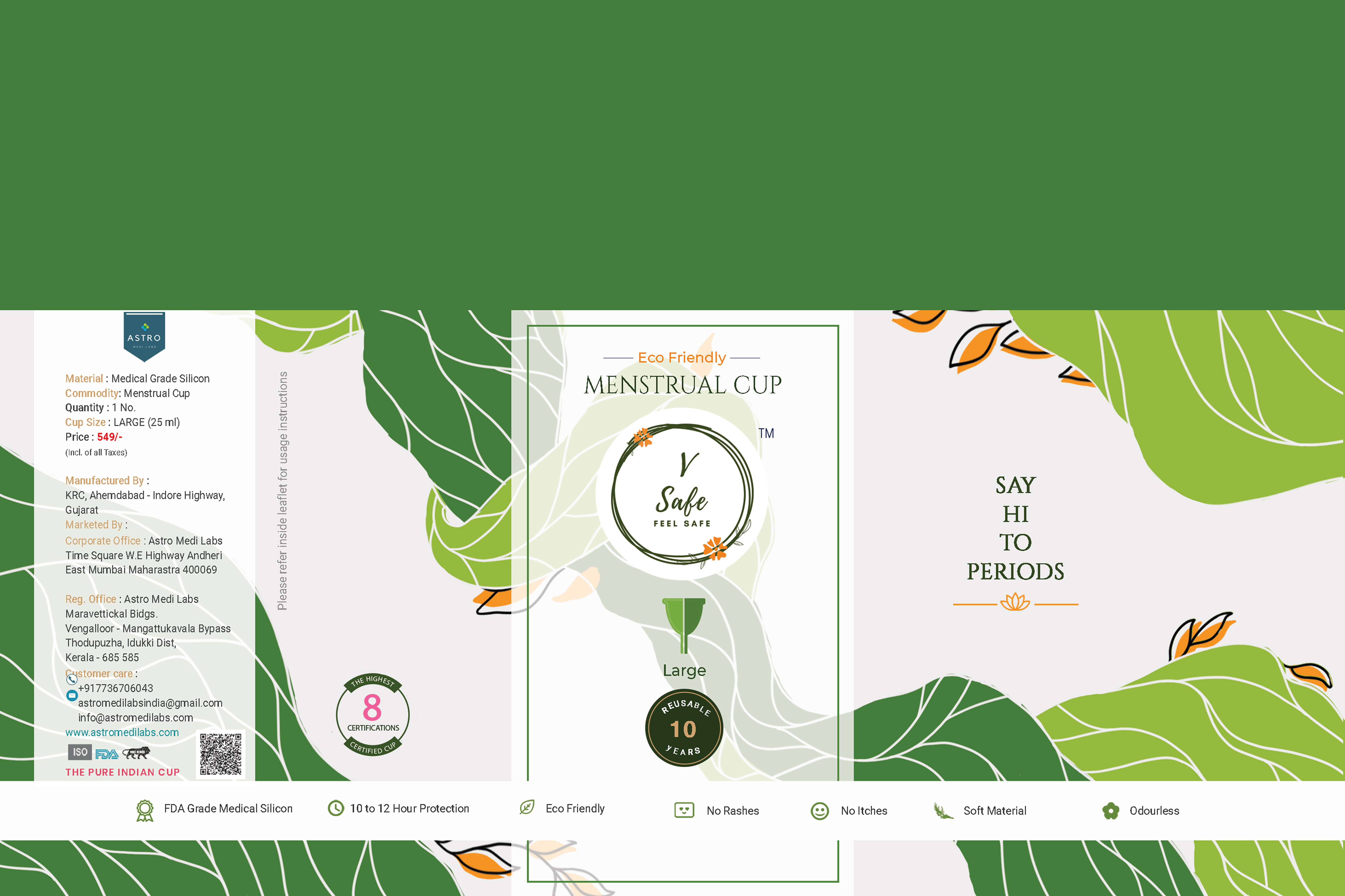
The concept was built around “safe and natural care.” Focused on breaking the stigma around menstrual products by using soft, approachable visuals and clear communication. The aim was to make users feel comfortable, confident, and informed.
Thought Process
‍
The concept was built around “safe and natural care.” Focused on breaking the stigma around menstrual products by using soft, approachable visuals and clear communication. The aim was to make users feel comfortable, confident, and informed.


Outcome
‍
Delivered a clean, reassuring, and user-friendly packaging design that highlights safety and hygiene. The design effectively builds trust, improves product perception, and aligns with modern, eco-conscious branding.